Essential Logo Design Knowledge
An awesome logo design could cost thousands of dollars. If you choose to do it yourself, it is possible. But it will take some time, tinkering, planning, and a willingness to go back to the drawing board. This article is a good first base of essential logo how-to.
Note: Advice Watch found that certain information about Logo found in Wikipedia** as of 02/04/2011 (though not exactly false) is not explained correctly, unclear, and/or potentially confusing, such being:
- Logos are either purely graphic (symbols/icons) or are composed of the name of the organization (a logotype or wordmark).
–From Wikipidea**
The clarification by AW is: A logo is not to be confused with a trademark. A logo can be trademarked. A word or words depending more on certain conditions can also be trademarked. A word can be a logo by its typeset or artistic design of how the word is presented, but the word itself is not a logo. Also, a word or words can be part of a logo (See Fig. 1 in the illustrations)…
See Fig. 1
This is mentioned because no good tutorial about logo design can be made without addressing some basics or background about trademarks. This information should be considered before anything else when designing a logo. When designing a logo for your business, you need to know some basics about trademarks for several reasons including but not limited to:
- Even if you do not plan on registering your trademark, your logo can be considered a trademark whether it is registered or not.
- Your logo may violate the intellectual property of another business by being too much like their logo, or by being suggestive of their logo or name.
What you need to know about trademarks before designing a logo:
- You do not need to register a trademark in order for it to be a legal trademark. The mark becomes your business property as soon as you begin using the mark in commerce (to help you sell or advertise your product or service); and as long as another similar business was not using it first. Also generally, the mark must not be an obvious representation of what you sell. –However, registering a trademark has benefits including but not limited to serving as a great form of evidence that you were using the mark by a certain date, should a dispute with another business ever arise about who was using the mark first. Also, registering a mark serves as a viable warning to other businesses that you are using the mark and intend on defending it vigorously.
- In a technical sense, a trademark refers to marks wherein a product or products are sold; whereas a service mark is for businesses that provide a service. But the “TM” warning is acceptable on service marks, and the term “trademark” is now considered inclusive of service marks.
- A logo of an image of what you do or sell in your business is hard to get trademark protection and possibly may not be able to be a registered trademark. If you were able to obtain registered status for such a logo, it would probably be a weak trademark. For example, if you sell Christmas trees, a logo of a Christmas or pine tree is probably not able to be trademarked for that business. It is too descriptive or generic. But if you used a pine tree in your logo, and your business is about something completely different, say selling computers, it could have strong trademark protection. Generally, the more describing a word, name, or image is of what you do or sell, the harder it is to obtain trademark protection. But perhaps a better place to use a pine tree in a logo is for a paper manufacturer. Most people know that paper at least conventionally, is ultimately made from trees. So it is suggestive, but not describing, and therefore can still have strong trademark protection. So, if you wanted to use a pine tree in your logo and sell Christmas trees, you most likely would have to add an element or uniqueness to the tree. For example, if the image showed a lightning bolt going through the tree, it could probably get suitable trademark protection.
- You should have a rough draft of your logo, and then do a trademark search at:
http://www.uspto.gov/trademarks/index.jsp to have a good sense of whether another similar business may be using a similar mark before you waste any more time designing a mark that may be in use. However, just because you do not find a mark does not mean that the mark is not being used.
Note: You must first use the Design Search Code Manual to look up the relevant Design Codes @ http://tess2.uspto.gov/tmdb/dscm/index.htm to get a sense on how to search trademarks. - This article is not about words or names, but a good analogy for logo design in consideration for trademark protection is considering some business names as they relate to trademarks. Some of the best names that have strong trademark protection yet are easy to remember, perhaps ironically are completely made up words that do not mean anything or translate to anything. For example, words/names like Exxon**, Tylenol**, Kodak**, Maalox**, and Reebok** never meant anything or even suggested anything until they were used in commerce. So the point is the same thing for your logo; your design need not necessarily mean anything or convey an image of anything¦
It can still be a powerful design. And the great thing about such a design is that it can most likely have very strong trademark protection.
————————————————————————
Now let’s get on with more of the actual design aspects of logo design.¦
First know that a logo can be viewed as the face of your business, and is often the first impression customers, partners, and the general public sees of your business. But this is an excellent starting point for designing a logo… Here is the key to logo design: Try to envision that you are designing a face for your business in the form of a drawing (A logo is not simply a drawing, but this is where you’ll start – with a series of sketches). |
Of the most important aspects about your logo…
It must differentiate your business from the masses of similar businesses.
Not all graphic designers agree on everything about logo design, but there are some common traits which we find among the greater majority of them…
- The majority of graphic designers agree that nearly always a logo should be simple, for a simple design is easily recognized and memorable. Simplicity is usually what even the largest of corporations want in a logo. More often than not, logos in a design stage need to be scaled back rather than features being added to it. (See Fig. 3).
- It should be appropriate for the business and or items sold from the business. (You don’t want an image of a clown in a wedding planning business).
- It should be effective without color. (Described further later).
- It should be memorable. There should be something about your logo that sticks. But referring back to #1, simplicity often does this trick.
- It should be describable And this is important for trademark purposes as well. For example, as in Fig. 2., if the business owner wanted to trademark the image as a logo, the description for the logo might be: “A silhouetted image of one man applying a jumping knee strike to the head of an opponent.” Describable also often relates to simplicity.
- It should be scalable. That is to say it still looks good and conveys the same impression from large
to small print or publishing’s. The Advice Watch logo is not the best example for this, but if we lived in a perfect world, perhaps we would all have the Nike** logo.
Not all graphic designers agree on some of the following:
- A logo should be attention grabbing.
It depends on what kind of business it is, and what may be sold. - Many designers disagree or have conflicting viewpoints on the issue of whether a logo should be timeless (lasting over the years effectively).
Indeed, many companies have effectively changed their logo, and even moved on to entirely different logos. So this is generally not of a top concern in designing a logo. As technology progresses, a simple logo may not be so simple. For all anyone can guess, it may come to the point 10-15 years from now that conventional logos are displayed in 3-D. Even the simplest technology of what we currently know as may be digitized and allow for 3-D on all aspects. Technology changes things and has always been a game changer in any field. Nonetheless, timelessness should be considered and at least attempted in the design. You don’t want to have to change your logo 2 years from now.
We don’t know what the future holds, but we know what the state of the art is today. What is important today is that a logo needs to preferably be attractive and effective without color, even if the logo is ultimately a colored design. Certain printing jobs cannot be done from a practical stance in color or full color. Furthermore, to save money you may opt for black and white copy or less color for certain printing jobs or advertisements. Also to be considered is if you may ever choose to do foil embossing of your logo, which generally is only done in gold or silver color.
Consider all the things that your logo will possibly ever be displayed on. This is the area of logo design where size matters. Not just too small, but believe it or not a logo can easily be too big to be effective. Take the Advice Watch logo for example: We made a big mistake once by designing our logo to be too big on a T-shirt design (see Fig. 5). We noticed that because the words “Advice” and “Watch” were separated a fairly great distance within the logo, many people with a quick glance only saw the word “Advice.” So having a smaller area printed on the T-shirt, perhaps in the upper left-hand corner would have been better observed.
One of the best things to do is simply look at as many logos as possible. Check out the logos of the major corporations. What are they doing with their logos? What are your competitors logos looking like? Don’t be like them.
Above all, don’t stop here. Get different perspectives of logo design. In fact, it is the plan of Advice Watch to have a top list of logo design sites and pages in the near future. Please let us know of any good ones that you may come across…
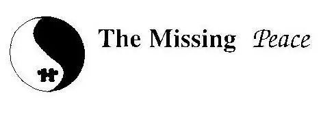
The above design is an example of a design wherein the name of the business is also suggested in the logo, and conveys a message. Also, this may be a case as pointed out in the article wherein words may be trademarked as a logo because the typesetting is unique by the words “The Missing” and “Peace” in different typesets. Of course, words can always be part of a logo wherein a picture is present.
Fig. 2
![]()
As mentioned in the article, “[a] logo of an image of what you do or sell in your business is hard to get trademark protection”… But a martial arts school owner could possibly get mediocre trademark protection on the above logo if he was the first to use a silhouette image in this case a jumping knee strike to the head of an opponent.
Fig. 3.
![]()
The above image is from the initial design stages and rough draft for designing the Advice Watch logo. As mentioned in the article, a common tendency is to overdo a logo. We had to scale back the logo. It could possibly convey too many things.
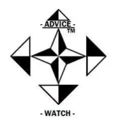
Fig. 4.
![]()
The name “Advice Watch” was hard to fit proportionately on the logo to match the other proportionate aspects of the logo. Rather than placing words left-to-right which is the conventional way to display a name, we decided to place one above the other. But this posed some problems. Because the words are so far apart, we needed to be sure the public connected them as one name, so we put hyphens or dashes… They don’t mean anything, they are just there to make the visual connection to the words.
Fig. 5. Believe it or not, bigger is not always better when printing or displaying a logo on something. We found that many people from a quick glance, only noticed the “Advice” word and didn’t catch the word “Watch” either by not reading or not catching it altogether. It would have been better to display a smaller logo in an upper corner. |
Fig. 6.
The Subaru** logo is pretty interesting. The Subaru in Japanese language refers to the 7 Sisters star constellation. It may have been difficult for a telescope manufacturer to have strong trademark protection for this logo. But beautiful and protectable for a vehicle manufacturer. -Subaru logo published with permission by Subaru of America, Inc. |